mirror of
https://github.com/go-gitea/gitea.git
synced 2025-11-04 00:02:20 -05:00
 5ab1c7acec
The `ul li` styles were polluted. Before: 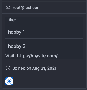 After: 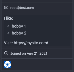
162 lines
2.6 KiB
CSS
162 lines
2.6 KiB
CSS
.user.profile .ui.card .header {
|
|
display: block;
|
|
font-weight: 600;
|
|
font-size: 1.3rem;
|
|
margin-top: -0.2rem;
|
|
line-height: 1.3rem;
|
|
}
|
|
|
|
.user.profile .ui.card .profile-avatar-name {
|
|
border-top: none;
|
|
text-align: center;
|
|
}
|
|
|
|
.user.profile .ui.card .extra.content {
|
|
padding: 0;
|
|
}
|
|
|
|
.user.profile .ui.card .extra.content > ul {
|
|
margin: 0;
|
|
padding: 0;
|
|
}
|
|
|
|
.user.profile .ui.card .extra.content > ul > li {
|
|
padding: 10px;
|
|
list-style: none;
|
|
}
|
|
|
|
.user.profile .ui.card .extra.content > ul > li:not(:last-child) {
|
|
border-bottom: 1px solid var(--color-secondary);
|
|
}
|
|
|
|
.user.profile .ui.card .extra.content > ul > li .svg {
|
|
margin-left: 1px;
|
|
margin-right: 5px;
|
|
}
|
|
|
|
.user.profile .ui.card .extra.content > ul > li.follow .ui.button {
|
|
width: 100%;
|
|
}
|
|
|
|
.user.profile .ui.card #profile-avatar {
|
|
background: none;
|
|
padding: 1rem 1rem 0.25rem;
|
|
justify-content: center;
|
|
}
|
|
|
|
.user.profile .ui.card #profile-avatar img {
|
|
width: 100%;
|
|
height: auto;
|
|
object-fit: contain;
|
|
margin: 0;
|
|
}
|
|
|
|
@media (max-width: 767px) {
|
|
.user.profile .ui.card #profile-avatar img {
|
|
width: 30vw;
|
|
}
|
|
}
|
|
|
|
@media (max-width: 767px) {
|
|
.user.profile .ui.card {
|
|
width: 100%;
|
|
}
|
|
}
|
|
|
|
.user.profile .ui.repository.list {
|
|
margin-top: 25px;
|
|
}
|
|
|
|
.user.profile .ui.repository.list .repo-title .labels {
|
|
word-break: normal;
|
|
flex-shrink: 0;
|
|
}
|
|
|
|
.user.profile #loading-heatmap {
|
|
margin-bottom: 1em;
|
|
}
|
|
|
|
.user.profile .ui.secondary.stackable.pointing.menu {
|
|
flex-wrap: wrap;
|
|
}
|
|
|
|
.user.followers .header.name {
|
|
font-size: 20px;
|
|
line-height: 24px;
|
|
vertical-align: middle;
|
|
}
|
|
|
|
.user.followers .follow .ui.button {
|
|
padding: 8px 15px;
|
|
}
|
|
|
|
.user .button.adopt,
|
|
.user .button.delete {
|
|
margin-top: -15px;
|
|
margin-bottom: -15px;
|
|
}
|
|
|
|
.user .button.adopt .label,
|
|
.user .button.delete .label {
|
|
vertical-align: middle;
|
|
}
|
|
|
|
.user.link-account:not(.icon) {
|
|
padding-top: 15px;
|
|
padding-bottom: 5px;
|
|
}
|
|
|
|
.user.settings .iconFloat {
|
|
float: left;
|
|
}
|
|
|
|
.user-orgs {
|
|
display: flex;
|
|
flex-flow: row wrap;
|
|
padding: 0;
|
|
margin: -3px !important;
|
|
}
|
|
|
|
.user-orgs > li {
|
|
display: flex;
|
|
border-bottom: 0 !important;
|
|
padding: 3px !important;
|
|
width: 20%;
|
|
max-width: 60px;
|
|
}
|
|
|
|
.user-badges {
|
|
display: grid;
|
|
grid-template-columns: repeat(auto-fill, 64px);
|
|
gap: 2px;
|
|
}
|
|
|
|
.user-badges img {
|
|
object-fit: contain;
|
|
}
|
|
|
|
.user.notification table button {
|
|
padding: 3px 3px 3px 5px;
|
|
}
|
|
|
|
#notification_div .tab.segment {
|
|
overflow-x: auto;
|
|
}
|
|
|
|
#notification_div .tabular.menu .active.item {
|
|
background: var(--color-box-body);
|
|
}
|
|
|
|
#notification_table {
|
|
border: none;
|
|
}
|
|
|
|
#notification_table tr {
|
|
cursor: default;
|
|
}
|
|
|
|
#notification_table td a {
|
|
width: 100%;
|
|
display: inline-block;
|
|
}
|